On November 20th 2009:
- The first thing that I needed to research into was the key codes and conventions of existing music magazines.
- I looked at a range of genres.


- I looked at the different sort of magazines for different types of genres of music ranging from rock, heavy mental, pop, r&b and garage.
- I recognised that the different types of genres targetted their fans in different ways.
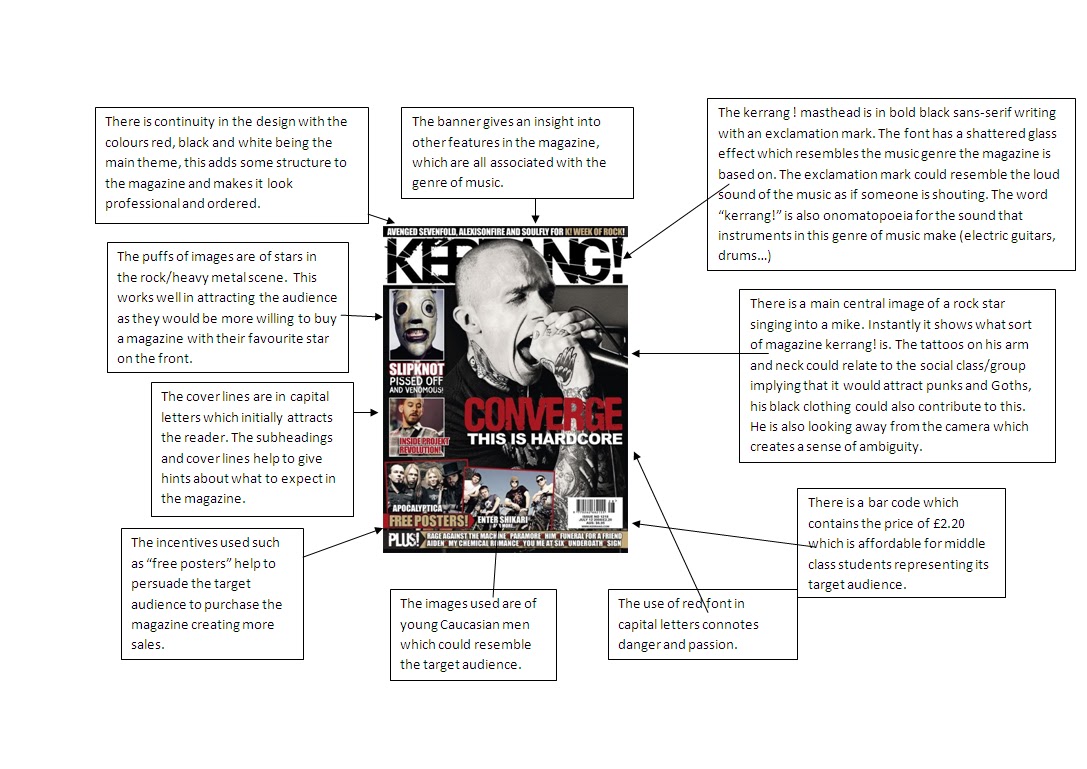
- In groups we were given one magazine that we was to analyse in detail to understand the key codes and conventions.

- I also went on to analyse another magazine looking further into the dennoations and connoations.
- I looked at websites of music magazines to see ways in which they attracted their target market.
- Some websites also contained previous issues so I could compare what was consitent in their design.
- Some websites such as the "The Word" had columns of hot topics which gave me an insight into what type of topics magazines covered and what sort of headlines were used.

- The Kerrang! website allowed access to its previous issues so I used this to look into the types of features included in the magazine.

- I also looked at:
http://www.thewire.co.uk/
http://www.rollingstone.com/
http://www.world-newspapers.com/music.html - This in particular gave me an insight into the variety of music magazines available as it had a list of magazines and the genreof music.
- I decided to focus on more pop and r&b and funky house music as this was the genre of music decided I was creating the magazine for.
- Masthead
- Banner
- Central Image
- Strapline
- Barcode
- Subheadings
- Coverlines
- Use of sweet spot
- Insitutional Info (e.g website)
- Date of Magazine/ Issue number
- As I was also creating a contents page I had to look further into the key codes and conventions of contents pages.


KEY CODES AND CONVENTIONS OF CONTENTS PAGES:
- Contents page title
- Number pages anchor images
- Editoral
- Page Numbers
- One main image
- Variety of images - one maine one
- Topics categorised into sections
- Magazine title/logo
- Captions with images
- Columns
- Continuity in design with cover page
- Different fonts
- Different sizes of fonts
- I also was to create a double page spread. I looked at existing magazines and their double page spreads.
- Name of artist and main title
- Subtitle to interview
- Columns
- Interviewers questions
- Interviewe's response
- Enlarged quotes
- Subtitle on what the page is about
- Mode of address often informal
- Continuity in design
- Extra images
- Journalists name
- Page numbers
- May be caption on images


- I researched into the construction of the magazine. Learnt that programmes such as adobe photoshop were used to make such.
- I decided to research into how adobe photoshop worked.
- I used the website http://www.pegaweb.com/tutorials/beginners-guide-adobe-photoshop/ which gave me information on a beginners guide to photoshop.
- I also used http://www.tutorialized.com/tutorials/Photoshop/1 (below) which I browsed to see the different elements used in photoshop.

- My music magazine was going to be designed so that it could be distributed into supermarkets and retail stores.
- I looked into who the distributors were for magazines such as kerrang!, The word, Vibe etc.
PLANNING
- I began brainstorming ideas for my cover page. I had to consider things such as my target audience, the genre of music which would then lead to a magazine name.
- I used the following sheet to help stimulate ideas about the whole magazine project.

- I considered having the genres of country music, pop music, urban music and r&b.
- I decided that funky house music was the one that I wanted to do.
Gender: Females
Age: 13 - 18
Ethnicity: Mixed
Class: Middle Class
- I devised a questionnaire so that I could find out what my target audience liked to see in music magazines they read.

- The genre of music helped to guide me on design ideas. I began to brainstorm and jot down ideas.

- I decided to brain storm the word "Funky House" to bring up some ideas.

- I used these ideas to help me think of appropriate names for a title.
- A couple of magazine names I came up with were: "SHAKE" "BASE" "PULSE""FUNK" "DELSE"
- After a couple hours of thinking I narrowed it down to the name "PULSE" which would be aimed at female teenagers from the age 14-18years.
- I thought pulse was appropriate because the beat of the music often imitates a pulse.
- I began to think of what I could include in the magazine relating back to my funky house brainstorm. I wrote out names of funky house artists and I began to think of appropriate cover lines.
- I used the website http://www.funkyhousemusic.com/ to help think of funky house artists.
- I considered the type of place the funky house genre of music would be played and incorporated it into some coverlines.
- "Free entry to 16+ club"
- "Attacca Pasante makes it funky for you"
- "Win free tickets to UK's funky house festival"
- "Be apart of a funky video"
- "Meet with top funky house star!"
- "Party all night long to funky!"
- "Funk up!"
- "Sea, sun and funky!"
- "Spice up your stereo with new funky house CD"
- "Drum and base crazy!"
- "Find out which star forgot their lyrics on stage!"
- "New tour date release for Doneao"
- "Funk up your life"
- "Feel it"
- "The never ending beat"
- Pump it up"
- "More than a beat"
- Now that I had a title and strapline I began to think of the type of font I wanted to use and whether it was going to be in capitals, lower case, bold writing or italic etc.
- I thought that the font should help to resemble the genre of the music so I thought that capitals and sans serif would demonstrate loudness, volume and boldness.
- A female artist
- A male artist
- A DJ
- A funky house band
- A funky house party with flashing lights
- Sun, sea beach and someone smiling
- Someone playing the drums
- Girls playing with tambourines
- A funky house concert with all the fans
- A group of people jumping with their hands in the air.
- I thought the easiest way to plan my front cover was to make a rough copy of how I wanted it to appear on a4 paper in pencil. This gave me the ability to actually see my ideas on paper and alter any changes.


- I needed to also plan the layout of my contents page.
- I looked into the range of categories available which included; NEWS, REVIEWS, FASHION, FEATURES, GIGS, SWAG, FESTIVALS, LIVE
- I decided to keep my categories down to 3 or 4.
- I began to plan out the layout of my double page spread
- It made sense to link the double page spread story to the main central image on the front cover.
- Most double page spreads in real life music magazines were about the artist and their future intentions with their music, or about their albums, recent tours, future tours, collaborations, music videos or in general their lives.
- I decided to combine a bit of everything into my double page spread and set it out like an interview as that was more interesting to read for the target audience.
- I decided that the mode of address used in the double page spread would be quite informal to match the middle class target audience.
- I read existing double page spread of the music magazine "Kerrang!" I liked the style of writing used their so I decided to use this influence in my way of writing.
- I began to write out the article on Microsoft word.
- Now that I had planned in detail my cover page, contents page and double page spread I began to start on the actual production of the print.
- Based on the rough copy on paper I began to consider what images and mise-en-scene I would need for my central image.
- I decided that I wanted my front cover main image to be located in a studio type setting and just be of a female, so I needed a black background.
- I did not have a black background in my house so decided to create it with a black sheet. However this was not successful and did not resemble a black background very professionally.


- I used the camera to expierment with different types of shots which included; low angle, high angle, medium close up, close up, canted angle, establishing shot.
- I decided that the best sort of shot was the medium close up.
- I took further images that I could use for the montage of images on my contents page and double page spread.
- Later on I realised that techniques on adobe photoshop could have made the background look more realistic.
- I continued to capture images on a digital camera on what I needed for the cover page. I made use of props like a guitar and drum sticks.
- I then got rid of the guitar as I realised it was not that relevant to funky house and baseline music.
- I had to use pool table sticks as drum sticks and I planned on using photoshop to crop and edit the pool sticks to look more like drums sticks if it was going to be used for my main image.


- I had to consider the amount of images I wanted on the page and the angle and size of the images, whether they were close ups, long shots, medium close ups.
- I took some medium close ups and long shots.
- I took images outside at night to see wheter they could come in useful.
- My actor for my main image was quite dressed up as I wanted to promote a classy, sophisticated look.
- I decided to take images of props associated with music, so I took a picture of a big record from early days and headphones.


- I was not quite sure what I was going to do with the images yet but I wanted a wide range of shots.
- A hoodie an headphones were put on the young boy actor who was pretending to be a young, current DJ.
- I took shots against a white background so that the image stood out more and so that adding text around the image would be easier
Creating my cover page
- I used adobe photoshop to create my cover page.
- I began by inserting a background image on my cover page which is seen below.

- I began to add the title of the magazine, strapline, gutter, barcode and another image on top of the background.

- After adjusting sizes of texts and the colours I ended up with the following:

- Over the weekend on Saturday 12th December I began considering what continuity in design I would need for the contents page and modified my ideas on paper according to the cover page.
- I created article names that I wanted to include on the contents page.
- When I returned to school I produced my contents page on adobe photoshop.
- I used the draft of my contents page and browsed through the images I had taken to start creating the first bit of my contents page.
- I began with having the pair of headphones as the background image.

- I then began to insert another layer of images on top of the background and rotated them and adjusted them to the position I wanted.

- After all the article names was added, I decided I want to add shapes to keep the continuity as I had also used it in the cover page. I ended up with the following:

Creating My Double Page Spread
December 22nd 2009
- Over the Christmas holidays I began to work on my double page spread.
- I built the basis of the double page spread by starting off with inserting images.

- When I began to insert text, it took alot of adjusting and copying and pasting so the columns were equal and the writing fit correctly. I looked at current double page spreads in everyday magazines and took note of some features such as quotes on the images and applied it to my magazine.
- At first the double page spread look like two separate pages, I had to use the brush tool on adobe photoshop to rub in the war so it looked as though it was joint to the other page so it was one a3 sheet.
- By friday 22nd January my double page spread was complete.

- On the week beginning the 25th, I spent my time producing a questionnaire and recording feedback from my audience for my magazine.

- By 30th I evaluated all the feedback I recieved and put them into simple paragraphs.
